.png)


.png)
If you’ve ever watched your page analytics and thought: “People are visiting… so why aren’t they registering?” You’re not alone.
Most event organizers spend enormous energy driving traffic via email campaigns, social posts, and paid ads, only to lose potential attendees at the final step. Your goal isn’t just page visits. It’s confirmed registrations.
That’s the difference between traffic generation (getting people to your page) and conversion optimization (getting them to complete registration).
This guide will walk you through the structure of a high-converting registration page, the psychology behind why people complete forms, and the tools that make it easy to implement
Let’s turn interested visitors into confirmed attendees!
What Is an Event Registration Landing Page?
An event registration landing page is a single-purpose page designed to drive one action: registration. Unlike a full event website—which may include speaker bios, sponsor pages, blog content, media galleries, and multiple navigation paths—a registration page is focused entirely on converting interest into commitment. Its job is to clearly answer the essential questions a potential attendee is asking: What is this event? Is it for me? Why should I attend? What does it cost? And how do I sign up?
It’s also important to distinguish between a homepage and a single-goal landing page. A homepage offers options and encourages exploration. A registration landing page removes distractions and guides visitors toward one clear outcome. That singular focus is why dedicated registration pages tend to convert at higher rates: they control the narrative, reduce cognitive overload, and make the next step obvious.
Depending on your setup, your registration page can either stand alone or be embedded directly into your existing website. Standalone pages work well for paid advertising campaigns or large events where you want full branding and messaging control. Embedded forms are ideal when you want registration to feel seamlessly integrated into your current site experience. The key is ensuring that whichever format you choose, the page maintains clarity, simplicity, and a clear call to action.
Before You Build: Define the Conversion Strategy
It might be tempting to start with fonts, colors, and design, but the highest converting pages start with strategy.
🎯 Define the Primary Goal
Be specific about what this page is meant to accomplish. Are you selling conference passes, collecting RSVPs, accepting retreat applications, or booking demos? One clear objective should guide the entire page. When the goal is precise, your messaging, form structure, and calls to action become sharper.
👥 Understand Audience Intent
Consider who is landing on the page. Cold traffic from paid ads needs more context, credibility, and explanation. Warm leads from your email list or past attendees need clarity and a smooth path to register. Match the depth of persuasion to the familiarity of your audience.
➡️ Evaluate Friction Tolerance
A free workshop should feel fast and simple to join. A $1,500 multi-day summit can support more detail and longer forms, but the extra steps should feel justified. The higher the commitment, the stronger your value proposition needs to be.
🚧 Identify Key Objections
Potential attendees are asking the same types of questions: Is this worth the price? What happens if I can’t attend? What exactly do I get? Will this actually help me?
Address those concerns directly within the page through clear benefits, detailed inclusions, testimonials, and transparent policies.
🔢 Define Conversion Metrics
Know what success looks like. Track conversion rate (CVR), form completion rate, drop-off points, and performance by traffic source. Without data, optimization is guesswork.
Core Structure of a High-Converting Registration Landing Page
Think of a high-converting registration page as a sequence of conversion blocks. Each block answers a specific question in the visitor’s mind and removes one more reason to hesitate. When the blocks are in the right order, they move through the page effortlessly.
Above-the-Fold Section
This is your decision gateway. In the first few seconds, a visitor should immediately understand what the event is, who it’s for, when it happens, and what to do next.
Include:
✅ A clear, outcome-driven headline that communicates the value
✅ Date, time, and location (or link if it’s virtual)
✅ One primary call-to-action
✅ A relevant visual, such as a speaker, venue, crowd, or on-brand event image.
Remember, if someone has to scroll to figure out what’s happening, you’ve already lost momentum. Clarity beats cleverness.
Value Proposition Section
Once visitors understand the basics, they’re asking a bigger question: “Why should I care?” This section should make the benefits feel specific, real, and worth the effort of registering.
Use outcome-driven bullets that highlight:
✅ What attendees will walk away with
✅ The problems this event will help solve
✅ The experience or transformation attendees can expect
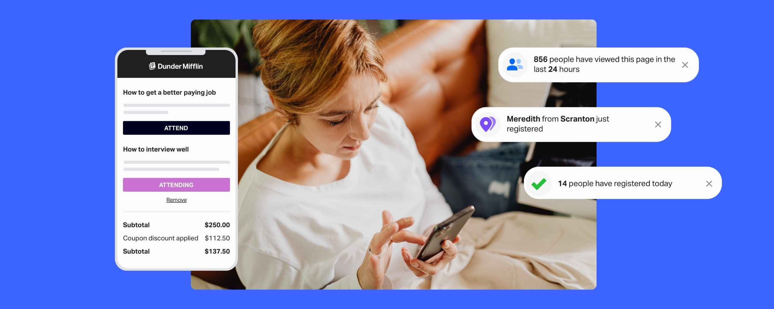
Social Proof & Credibility
Even if your event looks great on the landing page, people still look for safety signals. Social proof reduces perceived risk by showing that other people (especially people like them) trust your event. If 500 professionals attended last year, or if attendees rate your event 4.8/5, let people know. Specific proof is more persuasive than generic praise.
Include:
✅ Testimonials or short attendee quotes
✅ Speaker highlights and credentials
✅ Past attendance numbers or “join X others” messaging
✅ Partner, sponsor, or association logos
✅ Media mentions, if you have them
Event Details Section
At this point, you’re speaking to the analytical decision-maker who wants to understand what they’re actually getting. Remove uncertainty to help people visualize the experience. Specificity leads to more commitment than ambiguity.
Include:
✅ Agenda highlights
✅ What’s included with registration
✅ Location logistics details such as parking, check-in, arrival times, and livestream access, etc.
✅ What attendees receive, for example. materials, recordings, meals, swag, certificates, etc.
Pricing & Registration Section
This is where clarity matters most. If pricing feels confusing, incomplete, or even slightly “hidden,” people hesitate — and hesitation is where drop-off happens. By the time a visitor reaches this section, they’re close to deciding. Your job is to make that decision feel simple, transparent, and safe.
Present your pricing in a way that makes comparison easy and confidence natural. Everything someone needs to evaluate the investment should be visible without digging.
Make sure this section clearly communicates:
✅ A straightforward tier structure: Early Bird, General, VIP, etc.
✅ Exactly what each option includes
✅ Deadlines for any upcoming price changes or date cutoffs
✅ Payment options and what to expect at checkout
✅ Risk-reduction elements such as payment plans, purchase protection, or clear cancellation/refund policies
FAQ Block (Pre-Objection Handling)
A strong FAQ section prevents abandonment by proactively addressing common concerns before they turn into reasons for someone to leave the page. Include clear, concise answers to the most common logistical questions and practical topics:
✅ Refund policy - Clarify deadlines, transfer options, and any exceptions.
✅ What to bring - Help attendees feel prepared and confident.
✅ Recording access - Specify whether sessions will be available afterward.
✅ Accessibility - Outline accommodations for mobility, hearing, or visual needs.
✅ Dietary accommodations - Explain how food preferences and restrictions will be handled.
How to Create the Page
Once the strategy is clear, use the steps below as your guide to build your page.
1️⃣ Choose the Right Platform - Look for full customization, conditional logic, analytics, and branding control.
2️⃣ Define Ticket Types & Pricing Logic - Early bird pricing, group discounts, member rates, payment plans.
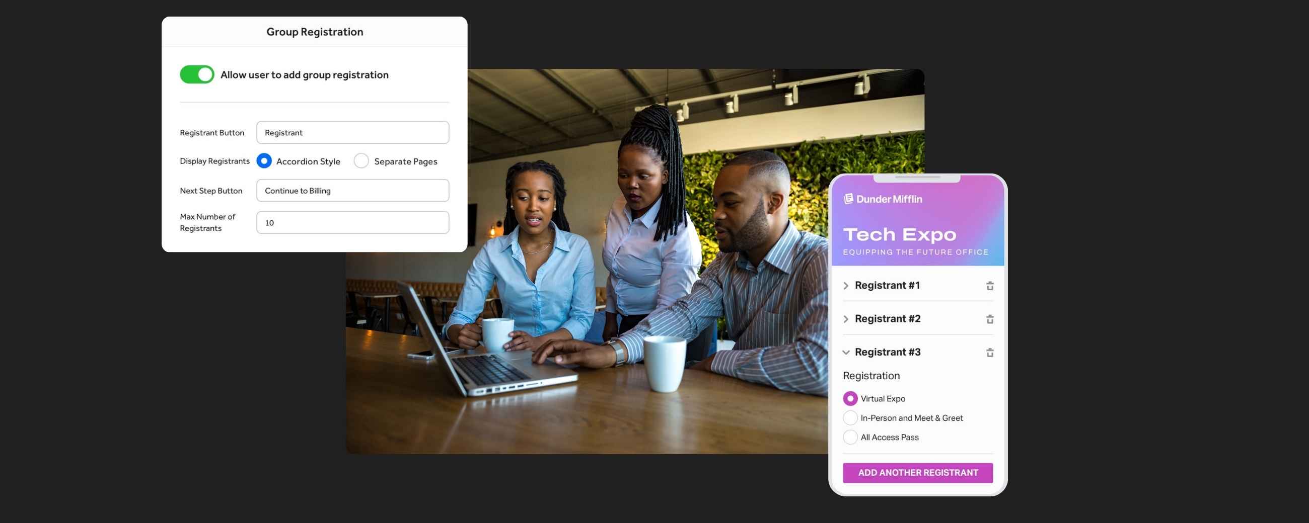
3️⃣ Build the Form (What to Ask vs. What to Avoid) - Collect only what you truly need. RegFox offers 40+ field types and conditional logic to keep forms dynamic
4️⃣ Design for Clarity (Layout & Visual Hierarchy) - Headlines → Benefits → Proof → Pricing → CTA.
5️⃣ Optimize for Mobile - A majority of registrations happen on mobile. Ensure fast load time and clean layout.
6️⃣ Add Tracking & Analytics - Use Google Analytics and Tag Manager integrations to measure conversions
7️⃣ Test Before Launch - Register yourself, test payment flow, view confirmation emails, and check mobile.
Psychological Triggers That Increase Registration Rates
Every registration decision is both logical and emotional. Psychological triggers are behavioral cues that help people move from interest to action by reducing uncertainty and increasing motivation. When used ethically and strategically, these triggers clarify value, reduce risk, and help people make confident decisions faster.
Urgency
Urgency works because it introduces a reason to act now instead of later. Countdown timers, expiring pricing tiers, and limited-time bonuses all signal that waiting has a cost. When deadlines are real and clearly communicated, they create forward momentum without feeling pushy.
Scarcity
Scarcity increases perceived value by highlighting limited availability. When seats are capped, sessions fill up, or a waitlist activates, the opportunity feels more tangible and less guaranteed.
Authority
Authority builds trust. Seek out recognized speakers, institutional partnerships, media mentions, and well-known sponsors to signal that your event is credible and professional. When attendees see respected names attached to your event, it reduces perceived risk.
Social Proof
Humans look to others when making decisions. Recent registration activity, testimonials, and visible attendance numbers show that others have already chosen to participate. Specific proof is more persuasive than general praise.
Commitment Bias
Commitment bias works because small commitments increase the likelihood of larger ones. Save-your-spot deposits, payment plans, or pre-registration with a card on file lower the barrier to entry while increasing psychological investment. Once someone has taken a small step toward attending, they’re far more likely to follow through.
Visual Friction Reduction
Some triggers are structural, not emotional. Clean layouts, fewer required fields, and a logical flow reduce cognitive load and make the page easy to navigate. A cluttered or confusing layout creates invisible resistance, but when pages feel simple, people act.
FAQs
What makes a registration page convert well?
Clear messaging, minimal friction, strong social proof, and obvious next steps.
How many fields should a registration form have?
As few as possible, but enough to run your event smoothly. Use conditional logic to avoid overwhelming users.
Should pricing be shown upfront?
Yes. Hidden pricing increases bounce rates. Transparency builds trust.
What’s the ideal length for a registration page?
As long as necessary to overcome objections, but no longer. Shorter works for free or low-cost events. Longer works for premium or complex events.
How do I reduce form abandonment?
Simplify fields, add progress indicators, enable saved payment methods, and clearly state refund policies
Can I customize my registration page branding?
Yes. Strong platforms allow full control over colors, fonts, layout, and even custom domains
How RegFox Helps You Build High-Converting Registration Pages
RegFox was built for event organizers who care about performance and optimized pages. Clarity, structure, psychology, tracking, and flexibility are built directly into the platform.
With RegFox, here’s what you get:
🗝️ Customizable registration pages with full branding control
🗝️ Advanced form logic to show the right questions at the right time
🗝️ Built-in payment processing with quick payouts
🗝️ Mobile-first design for seamless conversion
🗝️ Real-time analytics and reporting
🗝️ Flexible pricing structures, payment plans, waitlists, and more
You’re not locked into rigid templates.
You’re not forced into generic checkout experiences.
You’re building a high-converting registration engine designed to grow with your events.
If you’re ready to create a registration landing page that turns visitors into confirmed registrants, sign up today or reach out to our support team with questions.
We’re here to help you host your best event yet!
— The RegFox team
.webp)
.webp)


.svg)
.svg)
.jpg)